Designing for Lambda's Growth
At Lambda School, I partnered with Marketing and Growth Managers to design experiences optimizing for acquisition. My process often started with analyzing available data, articulating hypotheses, designing, testing, and iterating. Samples of the assets I designed are below. More available upon request.
Designing landing pages
When creating landing pages, I often start with wireframes to make sure that there's coherence in the structure and narrative - if there isn't, I would address it before moving to a high-fidelity design. Here's a preview of how that might look - a wireframe I created when working on a landing page for the Outcomes team, the B2B function of the business.

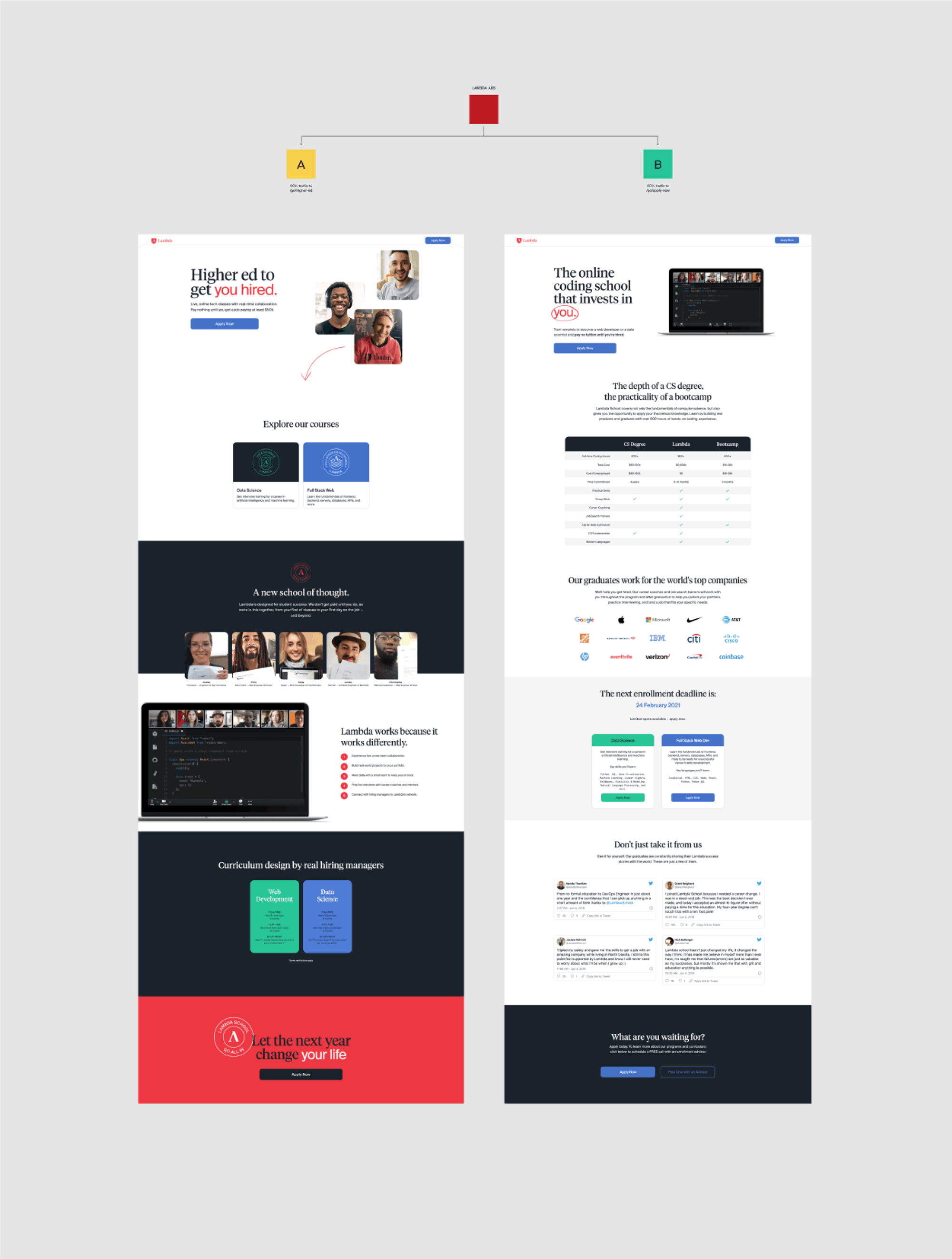
Designing A/B tests for conversion optimization
When landing pages are not performing as expected, there's always the opportunity to ask questions about what's not fitting with the user's mental models. On the test below, I came up with a few hypotheses about what could be improved on the page to increase conversion:
1. Add more relevant information - I believe landing pages, besides often being an invitation to form a longer-term relationship, need to provide enough value to the user to build trust and want to take the next step. Information and transparency often help to do that.
2. Sell a vision of the outcome - When thinking about the experience from a user's perspective, a question I often ask myself is "what's in it for me?". I think it's critical to address this question within the first few sections of the content.
3. Increase social proof - Testimonials are one of the most effective ways we have to build trust, and the more realistic they seem, the more we trust them. Although there were already pictures of graduates on the original version of the page, I wanted to experiment with adding real tweets and observe how visitors responded.
4. Create a sense of urgency - This is a well-known marketing principle. I thought that by adding the deadline of the next enrollment period next to each program, there was a higher chance that visitors would take action in the moment.
Based on these four ideas, I designed the B version of the landing page below, which ended up outperforming the original one.
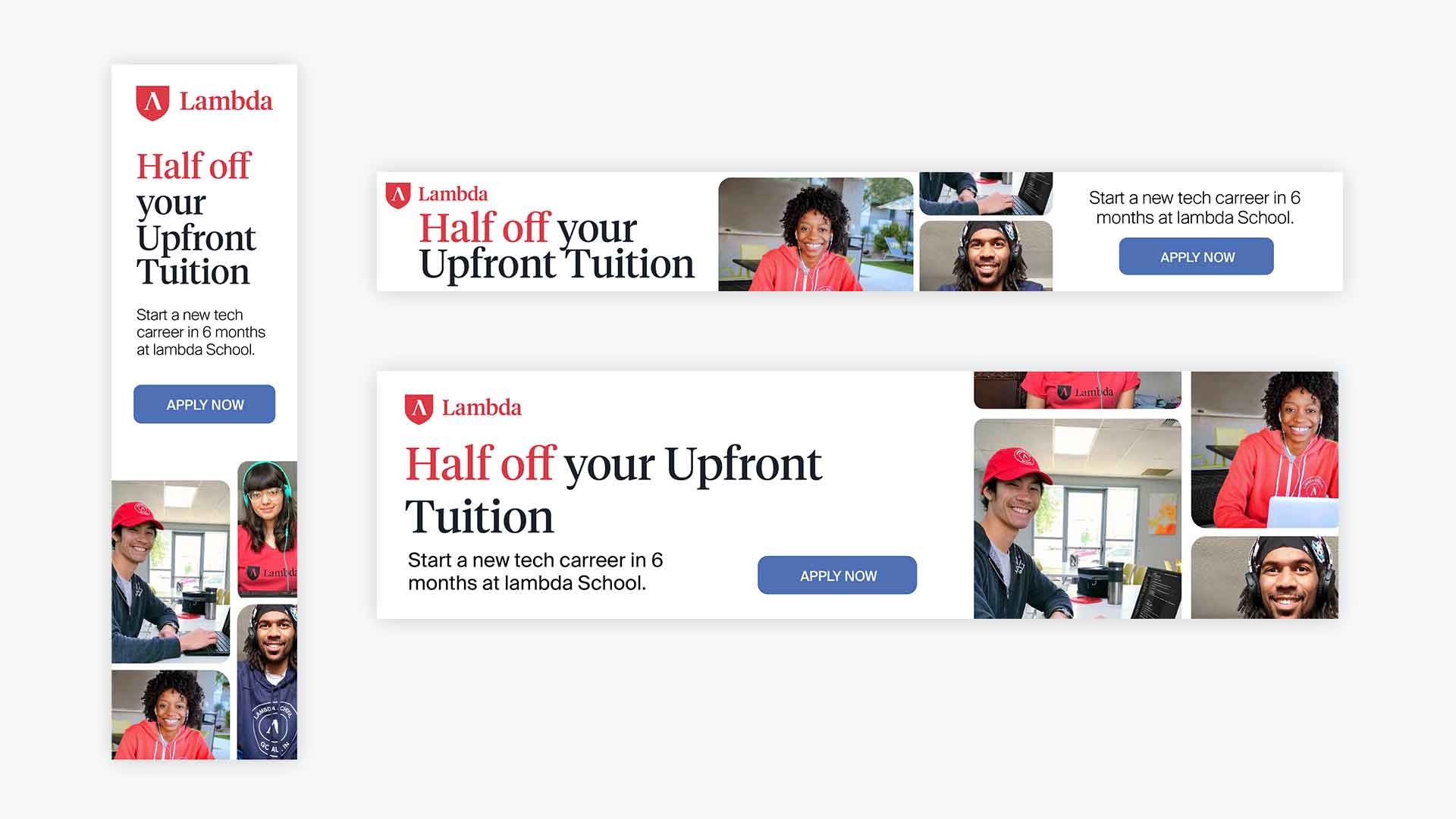
Ads
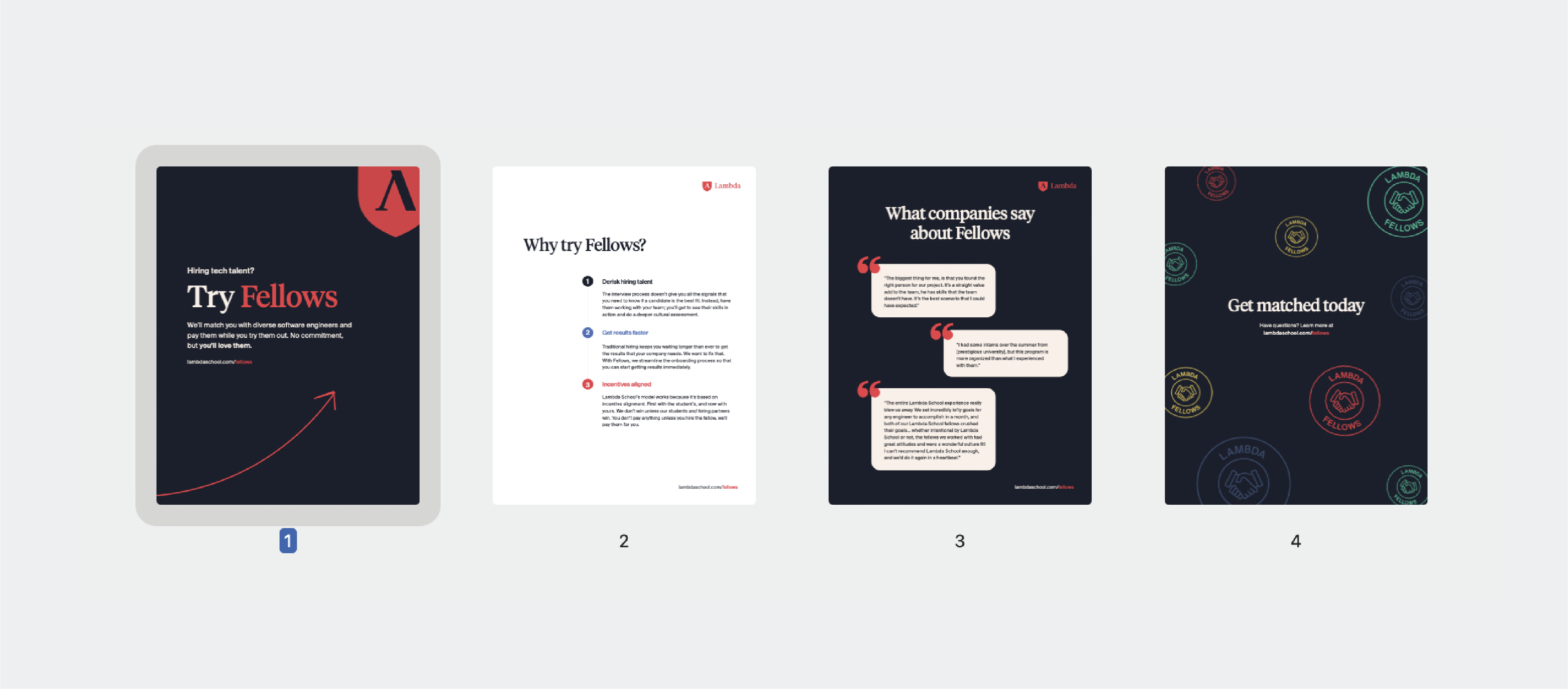
One-pagers